Thursday, February 28, 2013

Lettering in Art

Stuart Davis "The Mellow Pad":  He seems to use the letters more as just pictures, less as actual letters.  The way he combines them makes a very colorful collage.

Jasper Johns "Numbers in Color":  Johns' use of numbers in his art is interesting because even though you can tell they're numbers, it is still somewhat difficult to see them that way.  His use of all the different colors makes some of the numbers pop while some almost just blend into their background

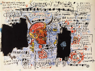
Jean Michel Basquiat "Leeches":  I found this artwork very interesting.  The use of words and letters almost makes this picture seem like the ramblings of a madman and it gives the art character.


Pablo Picasso "Still Life with Bottle of Rum":  Picasso uses the letters here almost as just more background.  It looks as if they were part of a poster of billboard in the scene he painted and he has just moved them around.

Line, Shape, Color art


These are my Line, Shape, Color drawings.  There really wasn't a lot of thought process with these, I just sort of drew what came to mind.  My two favorites are the flower one (3rd on right) and the lightning/crack one (2nd on left).  For the flower, i just played with different shades of yellow and orange and mixed them together in the flower.  And for the crack drawing, I wanted to play with shading and blending.

Class Logo


These are my two logos I designed for the Art & Tech program.  I chose a chameleon for the first one because I felt that the combination of their colors and their eyes makes them very "visual" creatures.  And for the second logo I made a brain and decorated it based on the fact that one side of the brain is meant to be artistic and the other side is more technical.

Making Fonts


I ended up making three different fonts for my project.  The first one was really just me playing with colors and drawing lines really quickly.  The other two fonts had a little more thought to them.  I wanted to play with shapes and basically subtracting from them in order to make letters.  My favorite of the three is the circle font.  I like the smoothness of the lines and just feel that it looks the best overall