2D design!
Tuesday, April 30, 2013
Movie Poster
I made a poster for the movie Alien. I ended up making two different versions because after making the full one, I thought one where the alien looks like it is coming out of the shadows would be cool
Fabric designs
Friday, April 5, 2013
tiling designs
Sonia Delaunay: I really like this fabric pattern because of how it connects. The lines in each section are clearly separated by size and color, but they still somehow match up to each other and that is really cool.
William Morris: I really liked this design because of the colors, specifically. Blue and red are very contrasting, but they work really well here. Also, the way they are faded gives the design a very old, aged look that adds character to it
Marimekko: I liked this print because of how much the different colors pop. With the use of layering and having half of the objects be black & white, all the colored ones really stand out from the background
Japanese Prints: I liked this one because you could continually copy this pattern and, because of how it was designed, the loops will always connect in the right spots, therefore making the pattern seamless
Thursday, April 4, 2013
citizen kane
This image uses two separate images and overlays them on each other. Even though the images are blended together, they are still both very distinctive from each other. This technique was probably used to show a transition between two different scenes.
This scene uses an interesting angle and the reflection in broken glass to show what is going on in the room. This angle gives the scene a somewhat eerie feel to it.
Thursday, February 28, 2013
Lettering in Art
Stuart Davis "The Mellow Pad": He seems to use the letters more as just pictures, less as actual letters. The way he combines them makes a very colorful collage.
Jasper Johns "Numbers in Color": Johns' use of numbers in his art is interesting because even though you can tell they're numbers, it is still somewhat difficult to see them that way. His use of all the different colors makes some of the numbers pop while some almost just blend into their background
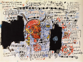
Jean Michel Basquiat "Leeches": I found this artwork very interesting. The use of words and letters almost makes this picture seem like the ramblings of a madman and it gives the art character.
Pablo Picasso "Still Life with Bottle of Rum": Picasso uses the letters here almost as just more background. It looks as if they were part of a poster of billboard in the scene he painted and he has just moved them around.
Line, Shape, Color art
These are my Line, Shape, Color drawings. There really wasn't a lot of thought process with these, I just sort of drew what came to mind. My two favorites are the flower one (3rd on right) and the lightning/crack one (2nd on left). For the flower, i just played with different shades of yellow and orange and mixed them together in the flower. And for the crack drawing, I wanted to play with shading and blending.
Subscribe to:
Comments (Atom)


